The Site Doctor gets creative with print
After months of painstaking work I can FINALLY reveal what we've been beavering away on -our new brochure with a twist. If you're involved in marketing at all you're probably already aware how hard it is to print interactive designs. Regardless of that, we needed some way of advertising so we got our thinking caps on.
The brief was simple: we needed to come up with a way of marketing our bespoke design and development services. Being a creative company we also wanted something that stood out from the other 1,001 West Midlands based web design companies. It should also reflect the attention to detail and quality that goes into our web design and development.
Our target audience was to be high end management so the brochure had to be quick and easy to navigate, have clear calls to actions and require minimum effort to read (unlike my blog!!).
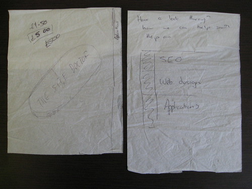
As all "good" ideas* start with a pen, napkin and one too many coffees, we trotted off to our favourite Costa for a brain storming session and here's what we came up with:
* not all good ideas do but some do but it's a good excuse for a coffee.
We went through all sorts of ideas ranging from having themed TicTacs produced, to sending out branded bottles of wine, most of the ideas were dismissed because they had either already been done or would just be binned/eaten and forgotten. We needed something that stood out.
For those of you who can't understand our scribbling's, we decided upon a brochure with a twist (or two).
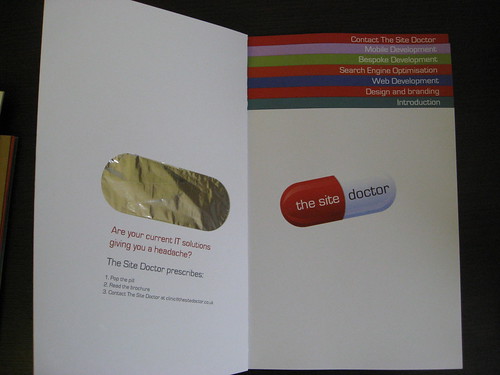
The First idea was to make the brochure quick and simple to navigate -like the websites we develop so we decided to go a little Avant Garde (off the wall/pushing the boundaries) and opted for a coloured tabbed navigation system, the idea was taken in part from an Argos catalogue which uses colours to separate the sections. I felt combining the tabs and colours would ensure the brochure was quick and easy to use.
The next issue we addressed was how to get the reader to open the brochure, it sounds silly but getting someone to open the brochure (let alone reading it) is pretty hard to do so we decided to offer the reader an incentive and what was better than our new stressball? Why not put one on the front of the brochure?
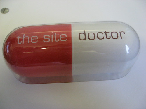
I've jumped a few stages in our thinking but here's the final product -a brochure with a stressball attached to the front, mimicking a pill packet (complete with foil on the inside to get the pill out), coloured tab page navigation and loads more.
Liked this post? Got a suggestion? Leave a comment