Another super logo design from another over priced design agency
Thanks to Gareth and The Register for this one, it had me laughing for a good long while.
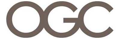
After the last design debacle (the London Olympics 2012) logo, you would have thought someone would have thought carefully before making the image public but here's the latest logo for the UK's Office of Government Commerce (OGC):
Other than being just plain boring it's ok right? Yeah, I thought so too until I was told to rotate it 90 degrees clockwise...
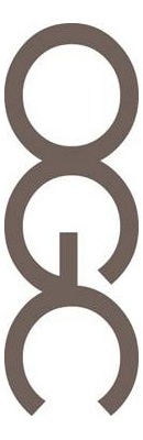
Brilliant! I'm still laughing!
Just goes to show (once again) that going with a large digital agency to create your brand identity isn't necessarily a good idea...
Having just rebranded Avant Garde hair salons (see the new logo here), I'm now checking our design. Nope all looks good so it's "Big Guys" 2 - "Little Guys" 0
Can't wait to see what the next government logo is...
Liked this post? Got a suggestion? Leave a comment